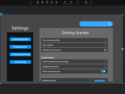
Daily UI 007 - Settings
Challenge 007: Settings. Design settings for something. Is it for security or privacy settings? Game settings? What is it and what's important? (It's up to you!)
Upon reading what today's challenge was, I was exited to think about how I could improve the settings menus of a web browser. I feel that most web browsers categorize their settings in bizarrely different ways, creating for a vastly varied experience with each of them. I thought about how I could streamline a web browser's settings to make it much more intuitive and therefore, user friendly.
The web browsers I researched and studied for this project were Google Chrome; Opera GX; Brave; and Microsoft Edge. I first learned what each web browser chooses to feature and prioritize in their settings menu.
Google Chrome has a fairly streamlined set of options in it's setting menu. Chrome also abundantly utilizes icons and logos, making it feel intuitive as to what each section's settings may include. Its sidebar and partitioning feel a bit cluttered with some sections having very few items in them; they could easily be grouped with other sections without having the user feel too overwhelmed.
Opera has the most options, allowing for and extreme amount of customization options, varying from multiple aesthetic theme settings; personal update feed settings; vpn capabilities; and multiple security measures on top of that. However, there are very few subsections that properly divide the settings into different categories. On top of this, little to no icons were used. All of this combined can easily make for a cluttered, hectic and overwhelming experience for the average user.
Both Brave's and Microsoft Edge's settings menus were the middle ground between Chrome and Opera. Brave had a proper usage of icons and categorization, making for a smooth settings menu while also featuring many customization options. On the other hand, Edge was in the middle ground in a negative way. It contained the most cluttered set of categories. While icons were used for each category, there were so many that the copious amount of icons made it counterproductive. If items were more properly spaced, then this issue could be alleviated somewhat.
After much deliberation, I decided to divide the settings menu into four sections: general settings in which the user will likely interact with the most via Getting Started; changing the aesthetics and readability of the browser and webpages with in Appearance; changing personal settings in Security and Privacy; and lastly all other miscellaneous items that the user is unlikely going to touch in Advanced Settings. I included a balance of options that I deemed important from studying the different settings menus. I made sure to narrow down the amount categories to just four from the many that the other menus provided.
I went with names and icons that would help guide the user without them having to click on each category to figure out what it contains. While the Getting Started category might seem to be vague, it is the category that always shows up first when the settings menu is opened. If there was every any doubt as to where a particular setting would go, I included the setting in every location the user might assume it would be. For example, I added the option to customize fonts in both the Appearance category and the Accessibility subcategory (under Advanced).
I also included a search function, always present at the top of the settings menu.
This challenge was made in Framer. A link for this prototype can be found here: https://framer.com/share/Browser-Settings--4ZTphRizTIvmIel8E1sg/KSQyaKNkf
