Daily UI #062
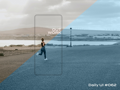
Alrighty, we've got a daily workout app that is relatively simplistic. It starts off with a photo that clues the user in to what they will be doing that day. For our purposes, the challenge is to go for a 30 minute run so the photo is of someone running. The actual description page simply says what you need to do along with some clarifiers, encouragement, weekly progress, and a button to start the workout. Once you begin your workout, you are presented with a progress screen that also has the music you are listening to and options to stop the workout, pause the workout, or play a pump-up song to get you over the finish line.
My thought process behind this design was to make it as simple as possible and retain focus on yourself and meeting your goals. While competition can encourage some people, others just need slight encouragement to help them maintain and meet their health goals. With this in mind, I wanted to focus on the workout given and strip any other superfluous things away.
Like what you see? Hit the "L" or leave a comment! I'm always open to feedback!


