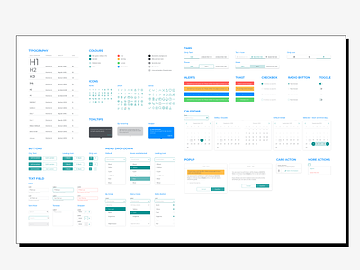
Hostmaker Design System
To ensure a consistent and seamless experience, we decided to align all design disciplines around a shared vision - design to create meaningful connections with all our stakeholders- and three main design principles - thoughtful, experiential, and flexible design. It was a good start, but it wasn't enough to get close to a "pixel-perfect" design.
As different designers and creative collaborate on the design process, plus we had multiple platforms and dimensions of our products, we find the need for creating a flexible design system. It becomes the design team's central source of truth and scales the Hostmaker experience sustainably and efficiently.
___
THE DESIGN PROCESS
The building of the Hostmaker flexible design system started with a list of variables (atoms) used everywhere to keep the different modules unified and the system scalable. We conducted an inventory and audit of all brand and UI elements with their variations and styles and debated which parts were essential.
The inventory was rethought to establish foundations: the atoms were redesigned, considering usability best practices, with web (desktop and mobile) and software versions. The goal was to guarantee its flexibility: we should be able to update any atom without breaking molecules or components.
The components' different status, behavior, and interaction were planned according to material design principles, constant communication with the development team, and tested for accessibility in other screens.
The Design System creation was a good exercise where brand and product design work side by side to achieve a responsible and accessible but flexible design and learn from each other fields.
___
COME TO LIFE
We defined a system naming convention, easy to understand and apply, is essential to keep the system organized and speak the same language. We based it on Material Design classification.
Zeroheight was the tool we used to help us categorize and present our design system, which integrates perfectly with Sketch and Figma. The development team gave life to it with a parallel investigation, finding the perfect tools to create the components with interactive previews, directly integrated with Zeroheight.
