Ter Planken
Hii ^^ Few years ago a small community around our street formed together. We regularly meet up to organise barbeques and all sorts of activities. It's a great way to get to know each other and welcome new neighbours.
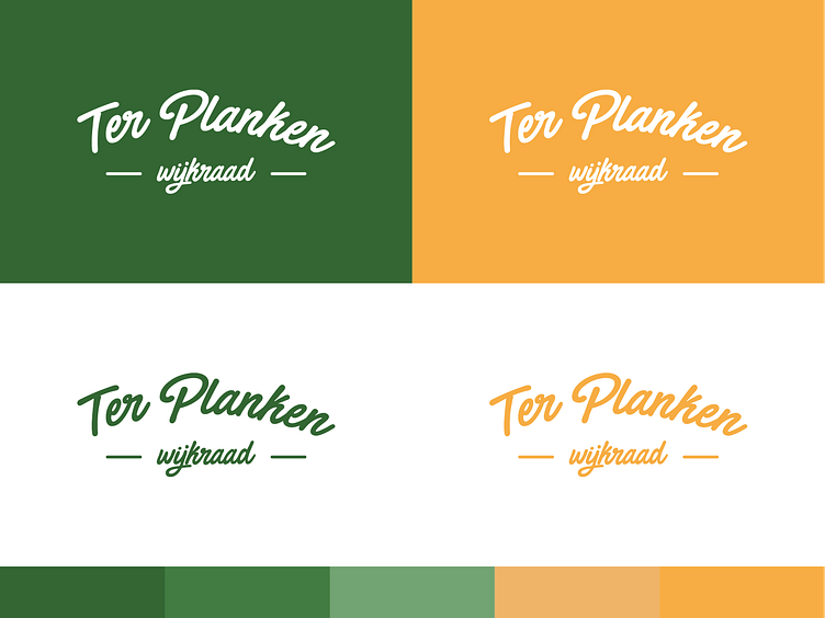
As a student graphic design I was asked to create a little logo, you know how it goes ;) Eager to gain every bit of experience I possibly can, I made some sketches, iterated with feedback and delivered a simple yet appealing wordmark. At least in my opinion.
Our town loves to represent itself with a fluo-orange color. Personally not too fond of that, so I used an orange-yellowish shade. The constrast was still not amazing though. Hence a soft green became the primairy color, representing the beautiful nature around our neighborhood.
