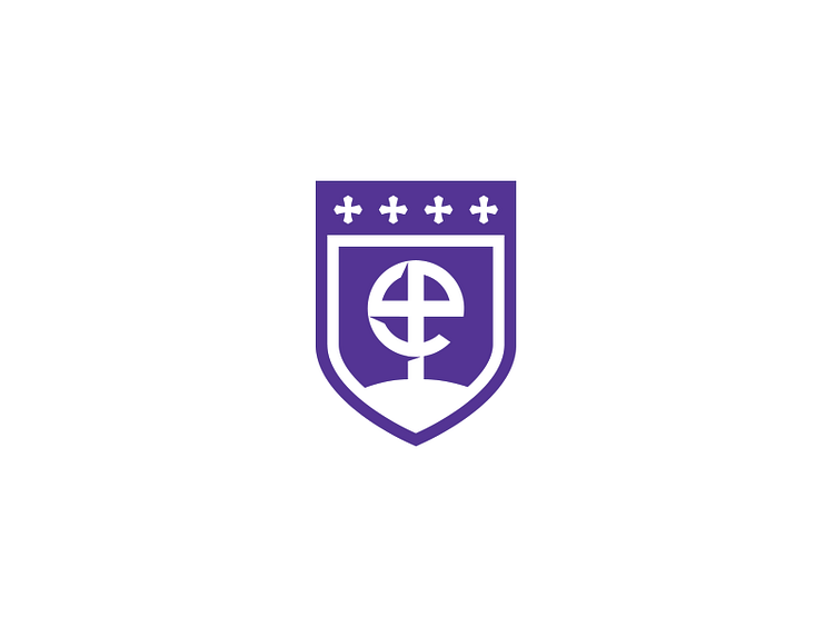
Episcopal School Brand Mark
Revised brand mark for a Episcopal private school that didn't make the final cut. The lowercase e is formed out of a cross that sits atop the steeple of a church. The 4 crosses above represent not only the four guiding values of the school, but also tie into the Episcopal faith's crest.
Bummed that this didn't get to move any further, but at the same time excited for the direction that they chose! Hopefully will be able to release that one by mid month.
More by Jared Granger View profile
Like
