Alexander Roastery Coffee Branding and packaging

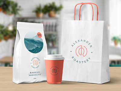
Alexander Roastery is a family owned business that wants a monogram as a part of their rebrand. By incorporating the roasting motion of a roaster and the coffee bean shape, the logo mark is personal and unique to the family business.
The colour of the guava fruit represents honesty and support, something that will make your day better. The key visual on the coffee bag packaging is a nod to the beautiful coffee plantations of Columbia, Brazil and Peru, something that felt unique, but subtle.
The outcome? Sales of Alexander Roastery coffee products have increased by 38% since the introduction of the new brand.
Full case study https://www.bettermade.com.au/works/alexander-roastery