Daily UI 006 - User Profile
Challenge 006: User Profile. Design a user profile and be mindful of the most important data, names, imagery, placement, etc. Is it for a serious profile? A social profile? (It's up to you!)
When I first read this challenge, I immediately had two questions in my head for for how I should go about designing this. The first being: "What is the website or app's most important features?" with the second being: "What aspects of the user profile should other users want to access first and foremost?"
The first question is important because it helps determine what items should be showcased in a user's profile. The second question is important as is helps determine what items should be prioritized; item placement on the screen, as each item's size and color, and more.
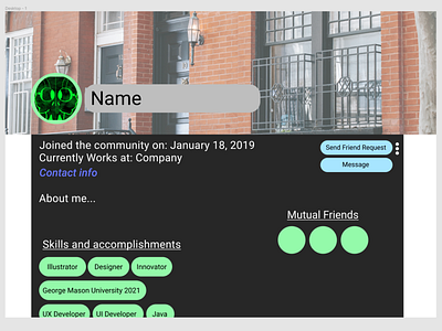
I imagined a semi-professional social website for this project, a cross between say, LinkedIn and Facebook. This means that a few things should be prioritized: the user's name; who they are; where they work; their contact information; and things their skills and accomplishments.
I chose to make these aspects of the profile stand out the most by making them relatively large, and gave them a significant color contrast with their backgrounds, making them pop out more to other users. I chose to make the contact information section purple to show that it is a clickable link, as opposed to the other parts of the screen. The user also has the option of adding a background banner to the top of their profile, similar to other social media apps for further customization.
In include the social aspect of the website, I added buttons for sending friend requests and messaging the user, as well as a mutual friends section. the stack menu next to the send friend request button will show more options, such as inviting the user to a group or blocking the user.
I chose to have a white background with a dark gray background in front of it to better center the layout. Having all of the items centered like they are here gives a better sense of unity and cohesion.
I used Figma for this prototype, which can be found here:
https://www.figma.com/proto/cykB6KJ4nxDBBBmWR2teHs/User-Profile?node-id=1%3A2&scaling=min-zoom&page-id=0%3A1
