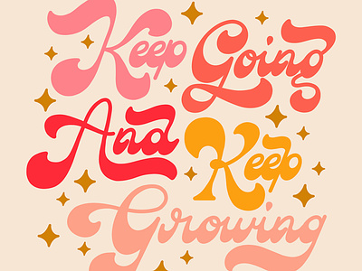
Keep Going and Keep Growing
Click through to see the process for lettering in this Retro Fluid Waves style for Liz Kohler Brown's new Letter Styles Library book 👀
1️⃣ I start with a loose sketch to get an idea of how much space each word will take up as well as how they fit together.
2️⃣ I set up horizontal and diagonal guides. In this case I also created an extra guide to help me draw the "fat bottom" part of the letters. This stage is also where I make adjustments to swashes and to the placement of each word.
3️⃣ I trace all the letters with a sleek brush (like the Monoline brush in Procreate) and make sure to fill every letter so I can get a sense of the overall visual weight. In this case I added a swash on the "A" to balance the left side of the design, which felt too light compared to the right side. I also added stars around the design to fill some of the whitespace.
4️⃣ Finally, I decide on the color palette and apply it to the design. This lettering style is very bold and expressive on its own, so I decided to forego extra stylization and kept the overall design simple.
Letter Styles Library is a step-by-step guide to 30 modern and vintage hand lettering styles that walks you through the whole process of creating each letter style and integrating it into finished illustrations. I am so excited to be featured in this book alongside some incredible fellow hand letterers: Jess Miller, Colleen Bringle, Lisa Taniguchi, Gia Graham, Alix Northrup, Ilana Griffo, Peggy Dean, and Flavia Salvadori.


