Daily UI #061
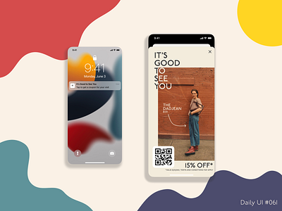
For this coupon challenge, I decided to stray away from a standalone coupon that can exist anywhere and instead wanted to tie it to a specific location. The idea behind this is that there is a reason for prompting the user to use this specific coupon (i.e. visiting a Madewell store for the first time or first time in a while). As for the design of the coupon, I wanted to feature one of their products to help nudge users into using the coupon on that specific item. However, I didn't want the coupon to appear ingenuine and simply trying to sell the user on something. So I decided to lead in with the greeting of "It's Good to See You," creating a deeper connection between the brand and the user.
Like what you see? Be sure to hit the "L" or leave a comment! I'm always open to feedback!
