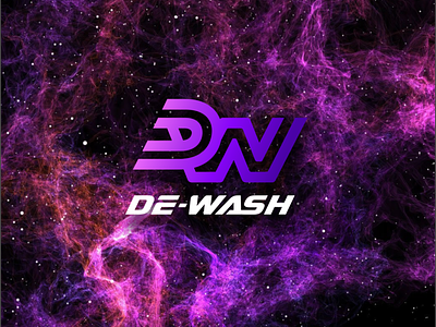
Car wash logo concept.
Original and stylish monogram in raspberry and purple shades at the request of the customer. Minimalism, style and dynamics are desirable criteria.
It was difficult to get both letters to read correctly in this style.
How do you think it turned out? Is the second letter readable?
You can read more about me and my work here:
Behance | Instagram
Quick links to contact me:
Telegram https://t.me/pechonkin_design
WhatsApp https://wa.me/+380932157763
E-mail v.pechenkin@gmail.com
More by Vladimir Pechonkin View profile
Like
