Sabi Brand Identity - Mark Exploration


![2-Sabi Branding [by Check DC].mp4](https://cdn.dribbble.com/users/7066828/screenshots/16282237/media/07c6eb9d431bb118154f51907ffcfe57.png?resize=400x300&vertical=center)
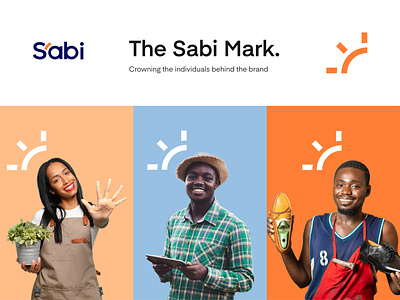
The Sabi brand aims to place focus on the stakeholders, and put them at the center of the brand's visual. Working on the Sabi project was exciting and we’re so proud to share the different assets and implementations that were done for the brand 🙌
We were able to create a brand identity for Sabi that not only helps them stand apart from competition, but also deeply reflects their core values.
The color direction allows imagery to shine without drawing too much attention and retaining the aesthetic value that has been defined.
Love the assets? Press the ❤️ button
