Watch Interface - Exploration Part 2
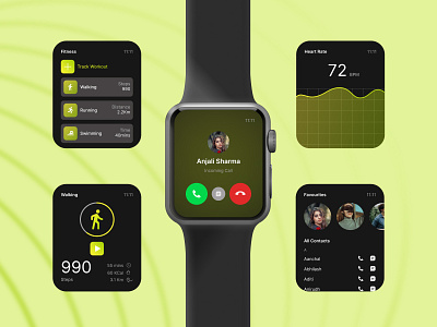
Screens with a Forest Green theme following the WatchOS visual design.
The design at the center shows the minimal call screen with Caller ID and large touch points for accepting/declining the call as they're the most used functions in this screen.
The Workouts screen show the list of all the tracked workouts with icons showing the activity and the quick metrices at the far right; packing in more information in less space.
The Workout Tracking screen has a main button to start/stop the activity with an interactive circular bar showcasing the progress made, with other finer details tucked away in the bottom right corner.
The ever updating heartrate screen shows a graphical view for quick comparison with time and the contacts screen shows the images of frequently contacted people up top for easy and quick access.
---------------------
💌 Let's make your idea a reality. Contact us!
Website: www.creolestudios.com
Email: hello@creolestudios.com
