Respond to a Second Call Redesign Concept

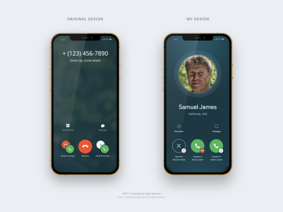
During the past few years I have encountered many people complaining about the confusing and somehow painful design of this famous screen. Yes, Apple iPhone's "respond to a second call while on another call" screen. Here, I have come up with a solution that might work better.
🟢 Regarding the main buttons, I think only the primary action needs to stay big which in this case are the green "answer the call" buttons. The user would instantly know that pressing any of those greens would answer the call.
🔴 The icon for the secondary actions (Hold and Hang up) can stay small as the circle color in their backs are dominant enough for the user to easily notice the secondary actions as well. Besides the clear copy text below each button would help to remove any possible remaining ambiguity.
⚪ The icon, color and appearance of the ignore button should definitely be different from the actual icon of "Hang Up/End Call" so that the user will be able to easily differentiate their purposes. It will also lower the decision making time siginificatnly.
🔵 I also rewrote some of the text copies for a better UX experience. Replaced them with more clear versions.
Let me know what you think in the comments.