Graphs & things
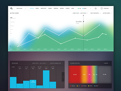
Shown above is a take at trying to get away from over used and boring flat design and trying to modify graphs to the visual form of what your brain actually interprets the data as. I'll explain..
A little while back an interesting article came across my screen detailing how the brain interprets info graphics and visual data. (http://blog.visual.ly/how-do-our-brains-process-infographics-mit-mongrel-shows-peripheral-vision-at-work/). I thought it would be interesting to try and apply the brains interpretation of data to various elements within this dashboard. My thought is that if data is presented in this manner it should create less anxiety over extended usage.
Furthermore, you'll notice subtle drop shadows on content blocks and active elements which aim to add a layer of depth.
Let me know your thoughts and give feedback that's useful, saying 'awesome' or 'that's shit' really doesn't help in any form.
