Daily UI 004 - Calculator
Challenge 004: Design a calculator. Standard, scientific, or specialty calculator for something such as a mortgage? Is it for a phone, a tablet, a web app?
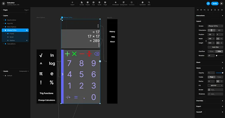
For my calculator, I chose to make simple calculator app for IOS. This meant including all of the basic functions of a calculator: addition; multiplication; subtraction; and division; as well as some basic algebraic functions; and options to use trigonometry functions; or switch to more complex calculators.
At first, I thought this challenge was fairly straightforward and simple. However, once I started making a paper prototype, I quickly realized the importance of button placement and menu locations and layouts.
I imagined how the average user would use this calculator in an everyday setting. A middle school or high school student would likely be working on math problems that require a calculator for the basic arithmetic portions of their work. Most people are right handed, meaning students might hold their phone with their left hand while writing with their right. Because of this, I placed important and more commonly used buttons at the bottom left hand side of the screen while lower priority buttons should be placed more to the top right of the screen.
More specifically, the addition, multiplication, subtraction, division, and backspace buttons are far away from where the user's thumb would be while in a resting position. Their distance form the numeric buttons help avoid misclicks and is more ergonomic for how phones are typically held.
I color coded the addition and multiplication symbols as different shades of green and the subtraction and division symbols as different shades of red. I chose greens for addition and multiplication both the symbols and the color green typically symbolize an increase in something. I did the same with the color red and the subtraction and division symbols as they are typically connected to the idea of a decrease in something. They are all different shades to make sure the addition and multiplication symbols are distinct from one another and the subtraction and division symbols are as well.
Numbers and buttons that modify them (the decimal and positive/negative buttons) are a bright shade of purple while the left hand hamburger-esque button; the backspace; and the equals buttons are a darker shade of purple. Going with a consistent color helps unify them through the Gestalt Law of Similarity. At the same time, using two different shades of purple uses the same Law of Similarity differently. It shows that the different colored buttons have different practical functions. Bright purple acts as the inputting of a number while dark purple acts as the changing of a number (by either removing parts of it or returning the result of a math function).
Two hamburger-esque menus are used here. Having more than one hamburger menus is typically looked down upon. However, I feel that if they are designed to look and feel different form each other, the two can easily coexist.
The hamburger menu at the top of the screen is placed so far at the top that it would be nearly impossible to misclick. It shows calculation history; an external link for help; and information about the app itself. While the history section can be useful for the user, the user can instead scroll up on the calculation display section to view recent history. The user can then click the history button to view significantly older calculations.
The hambuger-equse menu on the left of the screen takes some effort to misclick, but feels natural and satisfying to slide out and to the right when looking for more arithmetic options. The most commonly used calculations are displayed in this drop out menu, with the options to swap calculators (not included) bottom and to use trigonometry functions.
I used Framer to create a prototype which can be found here: https://framer.com/share/Calculator--McjVxok4iwYEMTLCntJG/JeRQPzB3b
