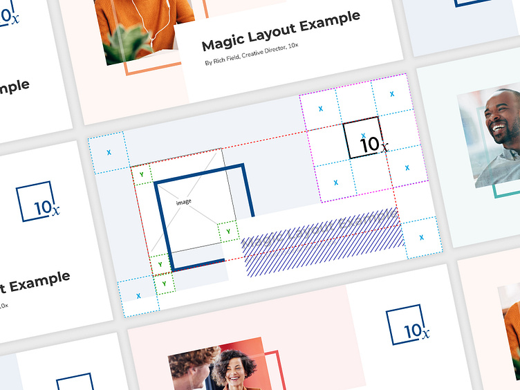
The Magic Layout – 10x Branding Composition
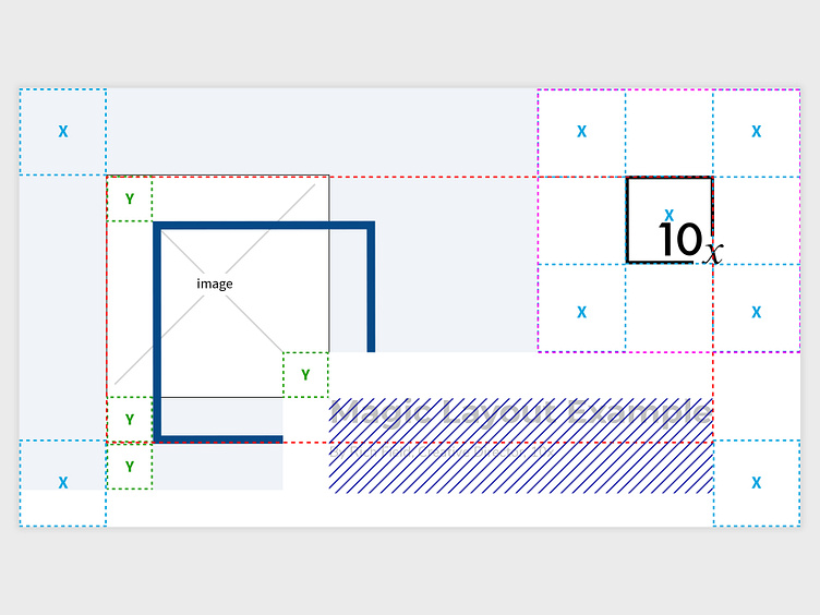
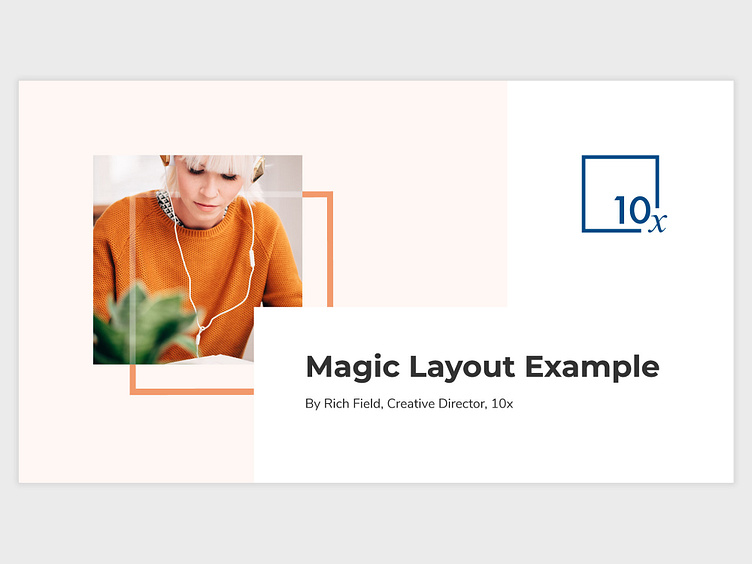
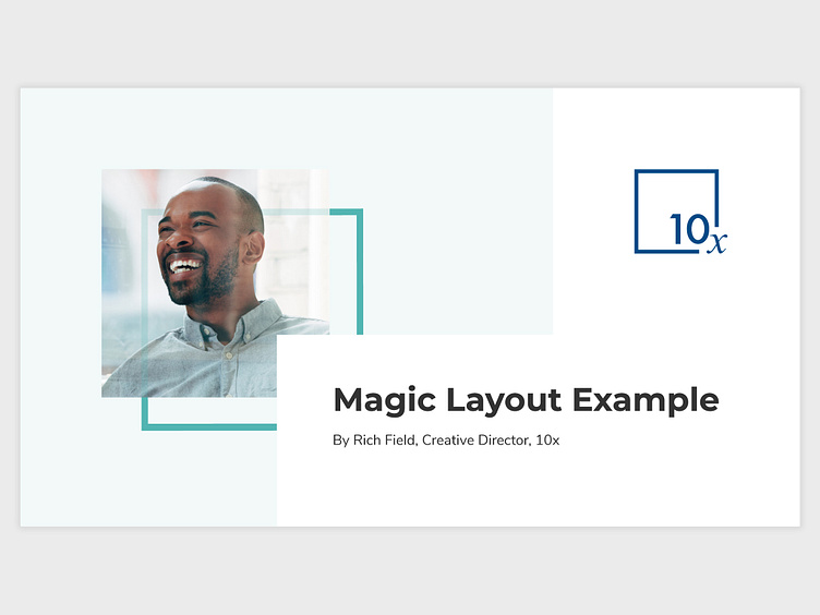
I quickly realised the square shape of the 10x logo could form an important element within the wider visual identity. It's a bit geeky I know, but this formula works for any layout size. The 10x logo forming the width/height of "x". This square then sits in each corner and the rest of the layout is derived from that.
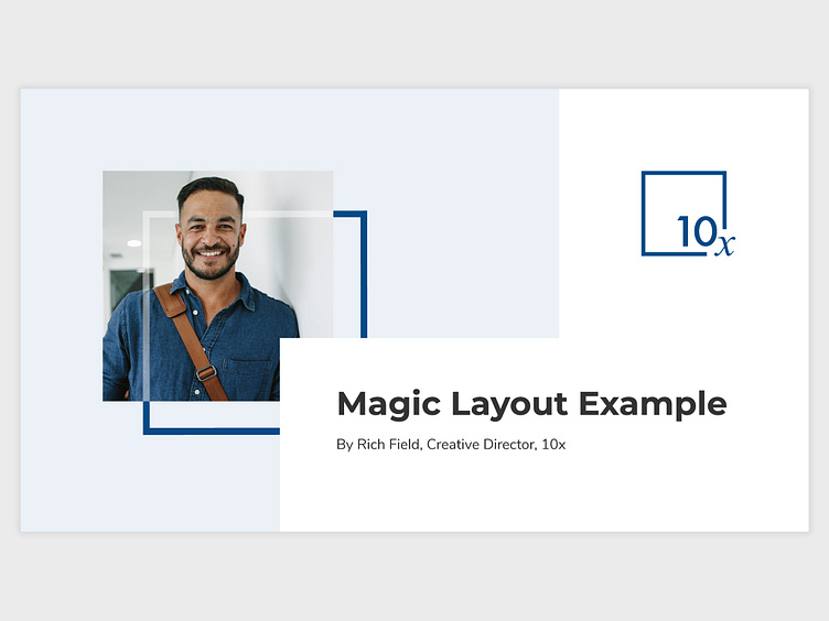
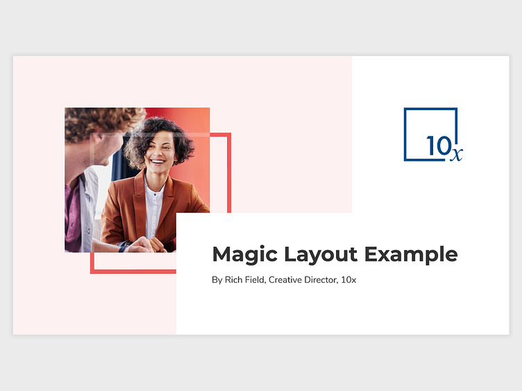
By creating what I called the "Magic Layout", the team was able to consistently conform to our style guide when bringing together multiple elements from our branding into a single composition.
In these examples you'll see how we chose images that helped form a monochromatic tone to each layout. We also used what I called the "8% rule"; using the core brand colour at 8% opacity in the background.
There's a lot going on in these layouts and I feel they work really well visually – neat and uncluttered. As always, I'd love to hear your views and thoughts.
