E-Scooter UX
Hello Everyone 👋
I would like to share my shot about electric scooter rental app.
High fidelity wireframes for e-scooter app
This is the my final project of UX/UX course
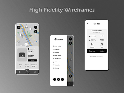
The app doesn't have home page, it has main page and it is a map navigation because customers can quickly find and rent a scooter without spending a lot of time. So unlock an electric scooter really easily is one part of a good experience, but we also considered what happens to the interface while someone is riding the scooter. A solution was to display the most important ride details, such as battery life, travel time and distance covered in a minimal but expanded way, so the user can focus on what matters.
What about the payment system it is very simple. Customers can add a MasterCard and Visa cards or pay with Apple Pay easily with one tap.
When the ride is over, customers can rate their experience with four different reactions to improve app services
Tool: Figma, Marvel app
Don't forget to hit the love button and feel free to give me some feedback ❤️
Hope you like it 🥰
------------
Follow me on: