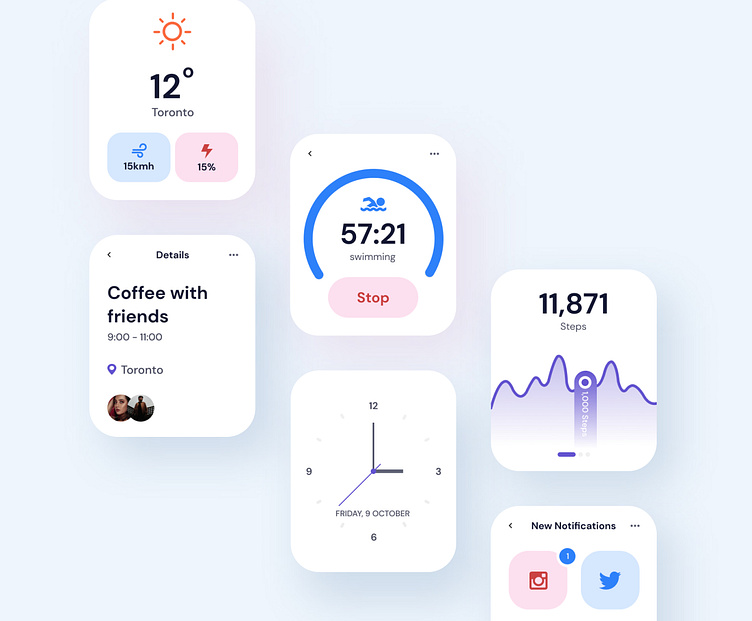
WatchOS UI Design concept for light mode ⌚️☀️
When it comes to designing interfaces for an iWatch app, having a minimal content is a must since there’s not enough space on the screen. 😵💫 You don’t want to display all the details that are secondary or not necessary to show. 🤭
What do you think?🤗
More by Noushin Behyan View profile
Like
