Daily UI 003 - Landing Page
Challenge 003: What's the main focus? Is it for a book, an album, a mobile app, a product? Consider important landing page elements (call-to-actions, clarity, etc.)
For this challenge, I imagined advertising to users about a new phone plan for companies. Admittedly, before starting this project I did not know what a Landing Page was. After doing some research, I learned that it's akin to a idea pitch in web form. Everything on the website should lead to one idea, one section of the site.
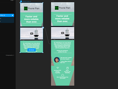
In order to implicitly direct the user's eyes toward the "Get Started" button, I chose to make text background trapezoidal, pointing downward towards the button. I made sure the user's eyes would always lead down to the button after reading or watching each section of the website by making sure the button is always present, regardless of the user's scrolling. This shape also encourages users to scroll down, as the downward motion of the trapezoids' lines convey the idea that they should keep looking down; scrolling down.
After designing this project, I realized that this type of trapezoidal layout could potentially be limiting as to what clients could post on it in the future. However, I personally believe that this works to the client's benefit. For the sake of a landing page, less is more as this type of layout encourages both the client and the users to hone in on switching to the phone plan as quickly as possible.
I put the form header at the top, followed by a video. This way, users would see the brief sentence and be intrigued in how the product can be faster and more reliable than ever. Showing them a video immediately afterwards allows users to interact with the website and easily understand what and how this phone plan suits them best.
Following this, the supporting statement expands on the header. I made sure to emphasize any important statistics that should pop out to the viewer by underlining them.
Last but not least, I added a testimonial and important product features at the bottom. I chose to leave these at the bottom because they are not as important as the header statement and video. The testimonial and the features are there to reinforce why the user should switch to this phone plan. They do not act as the hook.
I used Framer to create a prototype which can be found here:
https://framer.com/share/Landing-Page--5XscZ21N7VrzL3d2crfb/IQfqjdNhh
