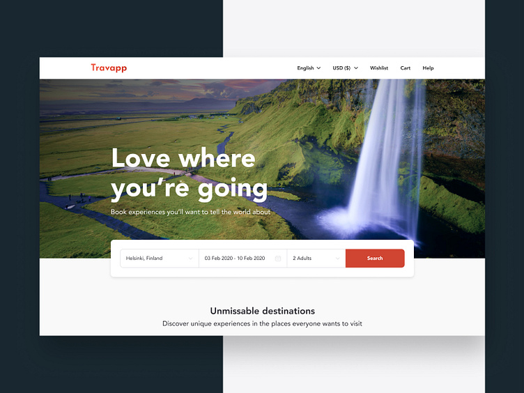
Travel design concept - desktop
Hi there, Dribblers community! Let’s go on with vacation planning, again 😊 Remember the travel design concept for mobile we've discussed earlier? This time we will talk about the travel design concept for desktop.
The main emphasis here falls on navigation. That’s why we’ve placed the Search for tours in a visible place on the Home page. Agree, ‘where,’ ‘when’ and ‘how many people’ are the main questions in travel search. All these items are in our Search too.
Moreover, this concept is a cross-platform progressive web app or a PWA . It means it performs well on all devices. Such an approach saves customers’ time and money on developing separate product versions for desktop and mobile. Contact us to turn your website into a progressive web app.
Don't forget to visit Codica team website for more case studies.
