Kolchie pre prepared cannabis joints
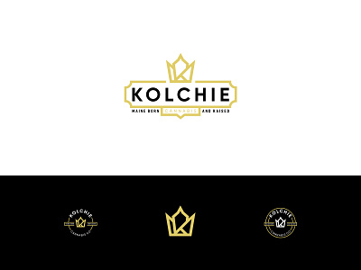
I have combined the letter K for the Kolchie company name, the crown for luxury and upscale feeling and the center point of the crown is the top of the joint. The coloring on it was black and gold to extend the high end style.
This work for a client features main logo, two versions of the rounded emblems that could be used for stickers and seal that is packaged around the potential package. In the lower part of the presentation the K symbol standing alone to point out it`s simplicity and compact design.
The Kolchie website : https://www.kolchiecannabis.com/
