Daily UI 002 - Credit Card Checkout
Challenge 002: Design a credit card checkout form or page. Don't forget the important elements such as the numbers, dates, security numbers, etc.
For this challenge, I thought of an Apple user trying to purchase several products on a food delivery app they have already bought from in the past.
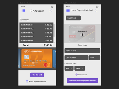
I created a scrollable list of all items the user plans to purchase in a summary section. On most other food delivery apps, all item information tends to be listed on the screen at once. This makes for a cluttered experience which can lead users to quickly filter out important information, such as if they accidentally added something to their order without realizing it. Creating a dedicated section to items in the user's cart streamlines this experience, allowing them to more easily focus on one piece of the screen at a time. I also made a conscious decision to add a scroll bar to communicate when the user does purchase multiple items.
When viewing a new image (or in this case a checkout screen), people tend to look at the middle first and allow the image to lead their eyes towards other sections of the image. So, I styled the order's total in semi-bold, placing it underneath the item summary, in the middle of the screen. Doing so will always make it easily visible for the user. Placing the total in the middle of the screen is important because the total is a vital piece of information that should be as accessible to the user as possible.
I showcase a section for previously used credit cards that the user can swipe though and select. Using images of physical credit cards makes for a more intuitive approach than simply listing a credit card's information in text form. This way, users can more easily and quickly choose their payment method.
I also created a screen for if the user would like to use a new payment method. If the user chooses to pay with a new credit card, I granted them the option to take a picture of their card. Once taken, it would automatically fill in the card's info. The user can still choose to manually type card info as they please.
I again chose to go for a more neutral color scheme, as conveys a clean look that is easy to understand and easily readable.
I used Framer to create a prototype. The prototype can be found here:
https://framer.com/share/Credit-Card-Checkout--p4xFHs3zjPBP5fMZrYtK/DZqBCxNIJ
