#DailyUI : Day 2 - Netflix Checkout Redesign
#DailyUI Challenge Day 2/100.
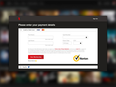
I decided to go for a redesign of Netflix's checkout page because last time I saw it, it looked really outdated. So I whipped out some picture from Google of what it used to look like in 2017 (it still looks very similar from what I can remember) and used that as my point of reference for the required info and the different payment methods. Decided to go for the classic "big red button" cause it fit with the color palette really well. Had a really fun time doing this and I can't wait for Day 3!
P. S. this is being posted on the same day I posted the Day 1 challenge. I missed a couple of days.
