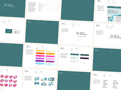
Key on Harmony Brand Guidelines
Here's a look into the Key on Harmony brand guidelines!
We created a modern design system to reinforce their main message and the reality of a healthy work-life balance and business success. Harmonious bold colors, vector graphics and strong visuals helped to position Key on Harmony as an approachable, thoughtfuul and customer-centric company.
Feedback always welcome!
Brand Guide by @angeliquevestil
Logo Design by @jake_paul_white
Want to work together? Send me a message: angelique@mvmedialab.com
More by Angelique Vestil View profile
Like
