Daily UI 001 - Sign Up Form
Challenge 001: Create a sign up page, modal, form, or app screen related to signing up for something. It could be for a volunteer event, contest registration, a giveaway, or anything you can image.
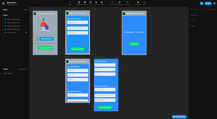
For this challenge, I imagined a user registering for a social media app akin to Twitter or Reddit. Thus, I chose to strictly inquire for the user's name and preferred email as personal information. From there, my prototype would inquire for a username and a password, as is standard when making most social media accounts.
I also chose to allow users to sign up with their Google Account, as most modern websites and apps are granting this option for users. This skips the prompts for the user's name and email.
I created prompts for the user's first and last name, and email in addition to their desired username and password in case the user chooses to make a new account without Google. For this screen, I knew that trying to fit everything onto the screen simultaneously could easily look too congested for the user. Because of this, I chose to separate this screen into two sections: one for personal info and another for app info. This would lighten the load for the user, making it easier to sign up in the app. I made the second section significantly lower than the first. The first password prompt can be seen without scrolling, but This makes it more intuitive for the user, implicitly telling them that they should scroll down without actually having to tell them to do so.
I applied Gestalt's Principle of Proximity to the Application Info, separating the username prompt from the password prompts. This helps emphasize to the user that they will have to enter their password twice to make sure they correctly enter in the password they want to use.
Other information, such as a personal profile information would not be necessary for using the app. So, I chose to omit such prompts and allow the user to fill them in later as desired.
I went with blue and light gray as my color scheme as blue is seen as relaxing and welcoming while light gray is a perfect balance between using a black screen vs a white screen. Light gray as a background allows for a good contrast between it and the text while still being bright and easy on the eyes; things that black screens and white screens have issues with respectively.
I used Framer to create a prototype. The prototype can be found here: https://framer.com/share/Sign-Up-Form--449hH1kqdlS7pKYoPutN/wX9PjV9Mz
