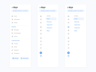
Navigation Redesign
Dang, Dribble! It's been a minute. I've been busy working on this product which is an SMS platform for Ministries and Recovery Centers. The previous navigation was just a list with no visual hierarchy. This solution organizes navigation items based on importance and whether or not the feature includes inbound messages, outbound messages, or both. We also designed a collapsed navigation view for when the user is browsing through sub-navigation.
More by Lydia Von Ebers View profile
Like
