Shogun Iconography
Iconography for the new Shogun site and brand refresh 🎉🎉
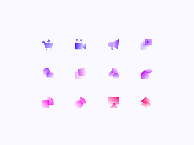
One of the more difficult parts of applying the new Shogun gradient was deciding if it should be applied to individual elements or applied across several elements. I ended up really liking the latter, because applying the gradient on small elements like icons was a little too repetitive, whereas applying it across elements created a gradient ramp as different elements came into view which felt like a better story and more thoughtful application.
I leaned into abstract shapes and layering with these in reference to the Shogun products being layered or connected to the backend of ecommerce stores. Added in some imperfections to keep them human and approachable 🤗
Anyway, we love a dissertation on iconography 💅🏼✨😌