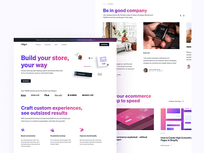
Shogun Homepage — Design
Sharing some work this week that I totally wanted to post about as it was happening, but didn't get around to! Definitely want to get better at sharing on here 🙏🏽
Here's a closer look at Shogun's latest homepage, featuring our new visual language and gradients, iconography and illustrations comprised of our two product colors. Definitely a design near and dear to my heart, aiming to capture the brand as it's evolved so dynamically.
More by Shogun View profile
Like
