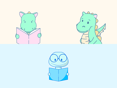
🐲 + 🪱 + 📚 = ❤️
Some illustrations I did a while ago. I played around with pastel colors as I love the soft look and feel.
If I come to use the characters in the future, I think I'd strive to rework them to be more consistent, e.g. the same stroke width as well as a similar shadow style.
I also experimented with different characters - a dragon vs a worm. How I got to the worm was obvious since there is the expression "bookworm" for a person who loves reading. The dragon is less obvious. As a kid, I got one book to review for a children magazine (I was a real bookworm back then) and it was about an author who formed dragons and who loves to read. The dragons developed some personalities and some of them were also very keen on books.
As it was the first article of mine that I ever wrote in my life that got published somewhere, the story and this book is something I treasure and about which I think a lot when I start thinking about books.
It's interesting how our memories keep forming ideas and give inspiration.
Dragons designed in Procreate on iPad. Worm designed in Affinity Designer on iPad.
The worm is one of the first projects I did using Affinity Designer - I think for the iPad it's one of the best vector applications I tried so far.
