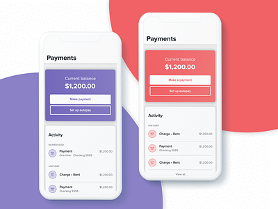
Resident Center dynamic colors
One of the things we learned while talking with property managers about a possible resident app was that they wanted a way to show that the app was "theirs." They didn't want residents to feel they were paying someone else or going through another person for maintenance requests.
So we implemented a tiny bit of logic, dynamic colors 😬 we gave property managers the ability to brand the mobile and web app to their branding colors. They can select some preset colors, set their HEX value, or upload their logo and select one out of 5 colors we extract from their logo.
Now, with multiple colors comes accessibility challenges, right? So we implemented a bit of logic to ensure the selected colors passed accessibility values, and if they don't, we would recommend the closest color to pass accessibility.
Pretty cool what you can create when you work close with engineers 🙌
