Grand Seiko - Credit Card Checkout | Daily UI Challenge 2021
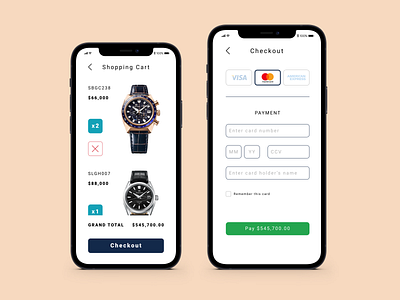
Day 2 #DailyUI - This is a user interface design for a credit card checkout screen, my second project I have had the pleasure of completing as part of the Daily UI Challenge for 2021 😃
Grand Seiko is one of very few fully-integrated true watch manufacturers in the world, processing mastery over the entire breadth of the watchmaking process from the research and development of component materials to manufacture, assembly, adjustment, inspection and shipment of timepieces from the heart of Japan watchmaking, the Nagano and Iwate Prefectures.
"𝙂𝙧𝙖𝙣𝙙 𝙎𝙚𝙞𝙠𝙤 𝙬𝙖𝙨 𝙘𝙧𝙚𝙖𝙩𝙚𝙙 𝙚𝙭𝙖𝙘𝙩𝙡𝙮 𝙤𝙣𝙚 𝙝𝙪𝙣𝙙𝙧𝙚𝙙 𝙮𝙚𝙖𝙧𝙨 𝙖𝙛𝙩𝙚𝙧 𝙩𝙝𝙚 𝙗𝙞𝙧𝙩𝙝 𝙤𝙛 𝙤𝙪𝙧 𝙛𝙤𝙪𝙣𝙙𝙚𝙧, 𝙢𝙮 𝙜𝙧𝙚𝙖𝙩-𝙜𝙧𝙖𝙣𝙙𝙛𝙖𝙩𝙝𝙚𝙧 𝙆𝙞𝙣𝙩𝙖𝙧𝙤 𝙃𝙖𝙩𝙩𝙤𝙧𝙞. 𝙏𝙤𝙙𝙖𝙮, 𝙗𝙪𝙞𝙡𝙙𝙞𝙣𝙜 𝙤𝙣 𝙝𝙞𝙨 𝙡𝙚𝙜𝙖𝙘𝙮, 𝙄 𝙝𝙖𝙫𝙚 𝙩𝙝𝙚 𝙝𝙤𝙣𝙤𝙧 𝙤𝙛 𝙨𝙚𝙩𝙩𝙞𝙣𝙜 𝙂𝙧𝙖𝙣𝙙 𝙎𝙚𝙞𝙠𝙤 𝙤𝙣 𝙩𝙝𝙚 𝙥𝙖𝙩𝙝 𝙩𝙤 𝙛𝙪𝙧𝙩𝙝𝙚𝙧 𝙨𝙪𝙘𝙘𝙚𝙨𝙨 𝙞𝙣 𝙞𝙩𝙨 𝙨𝙚𝙘𝙤𝙣𝙙 𝙨𝙞𝙭𝙩𝙮 𝙮𝙚𝙖𝙧 𝙘𝙮𝙘𝙡𝙚." - Shinji Hattori, Seiko Chairman & CEO on celebrating Grand Seiko's 60th anniversary in 2020
----------------------------------------
This design uses the base UI language of Grand Seiko and incorporated into a shopping app cart and checkout for mobile users. Taking inspiration from the serenity and harmony of Japanese design, the design elements are minimal but with substance and help the valued client to easily navigate between their cart items, shopping page, and payment during the checkout process. The user journey in navigation of the screen reflects the seamless experience of the 'Nature of Time' pioneered by Grand Seiko.
If you would like to see and test the Figma prototype I have developed for this design, feel free to send me a message 👉 stevenedrickwang@gmail.com
Thank you for checking out my design for the Daily UI Challenge!
