'13 Reasons Why' Book Cover Design
Custom illustration & cover design of Jay Asher’s debut novel 13 Reasons Why.
Genre: Young adult and coming of age.
Audience: Young adult: teens – adult, particularly women
After researching fan art, Netflix’s advertising and reading the book, I decided to illustrate 13 Reasons’ strongest thematic symbols in a style befitting to a YA book.
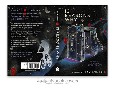
Each cassette tape provides a new character introduction, making the story and Hannah’s journey and subsequent decisions have a compounding domino effect, thereby on the front cover, I illustrated the tapes to show said snow balling domino effect.
Clay’s number 9 tape is drawn on the front tape to represent his POV and in the background, he’s depicted following Hannah’s map (coordinates) to pinnacle places within the story. Red Tear drops are used to represent the map’s coordinates as they’d be easily recognised by younger readers (ie Google Maps).
This project is a creative concept to illustrate my creative skills.
Full project link – ttps://imperiumillustrations.com.au/project/13reasonwhy/
