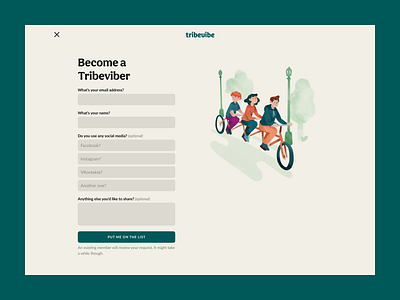
Tribevibe waitlist
Designing a website is so much about presenting the right message in the correct voice and tone—something that most clients do as an afterthought. Content should dictate design, not otherwise.
With that in mind, before opening the design tool, I analysed various keywords that trigger a positive emotional response, and create a deep sense of belonging, so that the audience feels safe and as part of a community that shares the same values and aspirations.
The website is not conversion-oriented, which is why you won‘t find any call-to-actions above the fold. You won‘t even find the much expected main navigation for that matter. Does that damage usability? I don‘t think so. Because the website aims to tell a story, one paragraph at a time, without distractions of click here, click there.
Luckily—this being my project—I could afford to take an unorthodox approach, and remove everything to the point where nothing else can be removed. To add a bit of playfulness I designed a few visuals that should make you smile and put you closer to the experience of the mobile app that is featured on the website.
What do you people think? I‘d love to hear your feedback.
—✦✤✦—
Team
❋ Zlatko Najdenovski - Design and content strategy
❋ Todor Dimov - Webflow development
☞ Visit www.tribevibe.earth
—✦✤✦—
Unsure whether your want some design and dev love for your website?
Write to us anyway. We'll review your ideas and reply to you with some bits of advice.
Created with 💖 from ensage.co

