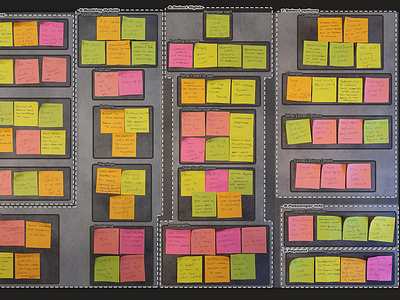
Affinity Diagram
The next step in the process was to collect all the data from the competitive benchmarking, online surveys and usability tests and write out notes of importance on a post it notes and organise the data into an affinity diagram.
The notes were then organised into groups that had similar findings.
The outcome was that patterns from the data started emerging and started highlighting the direction for the Fly UX website.
More by Samuel Lizzi View profile
Like
