Color Me Adventurous
Towards the end of projects when we’re creating guidelines for our clients, we’ll sometimes get the urge to create names for the brand colors. It’s a small addition, but naming colors is another mark of ownership over a new brand. Like a logotype or photography style, color is just as much a valuable piece of a brand’s identity, so we do what we can to demonstrate that with intention. At Focus Lab, it’s also a tiny spot where we can nod to any project wins, winks, or takeaways from our time spent with clients.
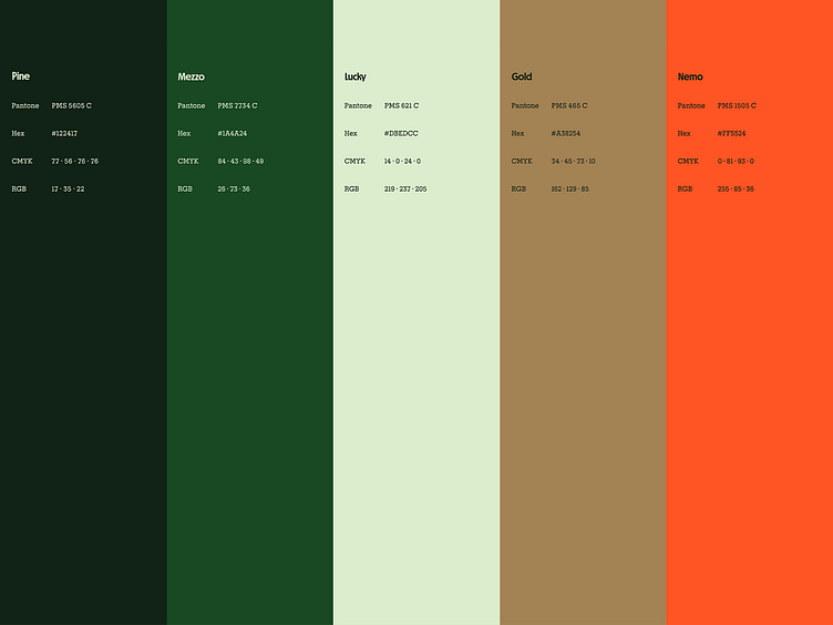
For Keymaster Games, color adds a cohesive sense of discovery and plays nicely with the brand’s gorgeous line of games. The mix of greens creates balance and allows individual colors to be amplified across aspects of the brand. Along with naming Keymaster’s mascot, we chose to name the colors in a way that would play with Red’s sense of cheer and adventure, while also still being relatively easy to recall.
Take a closer look and you’ll see what we mean. Pine is the brand’s deep forest green that’s used within lush color floods. And because Keymaster’s founder, Kyle Key, loves music, we chose Mezzo, or middle, for the medium-toned green. Lucky is the perfect name for the airy, optimistic mint used in the website’s header and footer copy. Gold is included for more obvious reasons, and finally Nemo: a storied captain and explorer (and a cute fish created by Pixar, a big company inspiration), is the bold hue for Red’s hair and the perfect contrast for the rest of the palette.
And there you have it! The Keymaster Games brand color palette. This post brings back great memories of our time with their team, and we’re so thrilled by the work we created together.
Read more about our collaboration with Keymaster Games in our latest case study: https://focuslab.agency/work/keymaster
--- Looking for a brand agency? We would love to hear from you. Email us: hello@focuslab.agency
