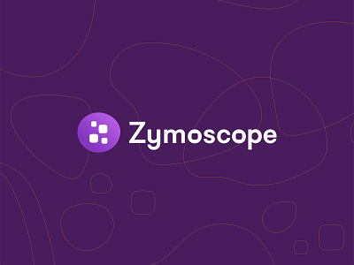
Zymoscope - Logo proposal 3
The 3rd and last proposal represents a drop of fermented liquid that contains data.
Everything is smooth and soft, the main palette is purple and pink, everything in this identity looks a bit dreamy and drunk, as a tribute to the alcohol created during the fermentation process.
The secondary palette has the colors of beer to keep in connection with the origins of the project. The first version of Zymoscope was made just to monitor the fermentation of beer.
This is the logo that the customers chose, in the next few days I'll share with you other parts of the visual identity, a little design system, the mobile app, and the website realized for Zymoscope.
If you enjoy it, please share some love pressing "L"
Looking for a new brand for your company?
Drop me a line and let's do it together!


