Twitter App Redesign
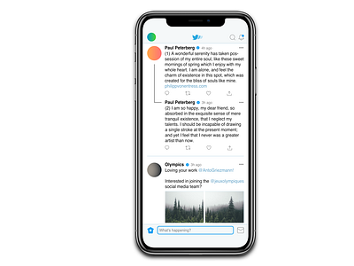
The top bar was pretty much useless, so I
moved both the search- and notification tabs
up there, with both having the ability to expand.
I kept the home menu views there too, but
moved them to the center and introducing the
ability to swipe between the different options.
The icons can be customised too!
I has happy with layout of the tweets them-
selves, so I didn't change anything there.
However, I did decide to edit the way threads
are shown in the feed by cleaning it up a bit.
With the bottom bar significantly emptier, I
moved the option to write a new tweet down
there and away from the big blue blob (similar
to the way it is shown in the desktop version).
The home- and message tabs stay in their
original place.
