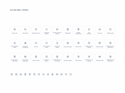
Crafting functional icons for ClearTax's website redesign
As part of ClearTax's rebranding to Clear, I also designed a detailed set of functional icons aimed at enhancing the usability and visual appeal of the product suite. These icons play a crucial role in providing a seamless user experience across various platforms.
Designing these functional icons was an integral part of enhancing the overall user experience for Clear’s new website. The minimalistic and consistent iconography supports users in navigating complex functionalities with ease, contributing to a smoother and more intuitive user journey.
Stay tuned for more insights into the design process and detailed case studies on my Dribbble.
More by Chetan ✶ Ramesh View profile
Like
