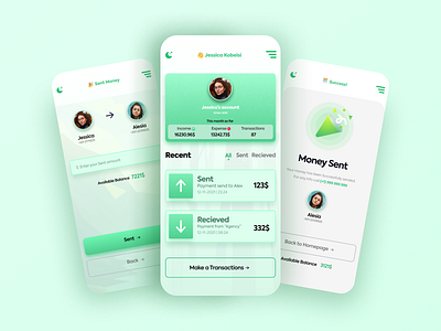
Finance App UI design (Light Mode)
👋 Creative Brains!
Here is the light mode of my Clean & Minimal Finance App UI design. You can also see the dark mode of this Finance App UI design.
The main focus of this finance app UI was to make it simple, straightforward — no cookie clutter. Also, I have chosen big and bold buttons for the button as the users can see the buttons from 1km far.
👊 For the colors, I have chosen dark green as the primary because green goes well with money-related app UI.
💬 Any feedback towards this Finance App UI will be highly appreciated and helpful for me.
💙 Press "L" if you like it and want to motivate this new designer 😍
More by 11hrs Creator View profile
Like
