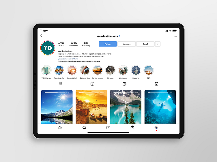
Instagram for iPad
Will be putting up more of this soon! (dark mode included ;p)
This design mock up was extremely fun to create. All assets was created with Illustrator (including the iPad itself), other than the photos used (google images for place holder purposes).
Main integrity of Instagram layout and orientation was kept and considered throughout the designing process, only major difference is first half of the screen. Bio/description was moved next to the profile and the buttons next to it since it's now on a wider screen. rest of the layout was done accordingly to what makes more sense.
More by MZ Studio View profile
Like
