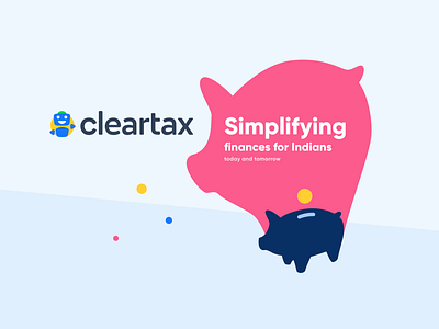
Consumer illustration: Simplifying finances for Indians
When I joined ClearTax, one of my goals was to create a fresh and engaging visual language for the brand and products. This involved experimenting with colors, shapes, and styles to find a look that was both unique and representative of ClearTax’s mission.
The illustration uses simple shapes and a clean design to convey the message clearly. This aligns with ClearTax’s goal of making financial management easy to understand for all users.
The use of a friendly color palette and soft shapes helps in creating an approachable image. This is important for a financial services company, as it helps in reducing the intimidation often associated with financial tasks.
The piggy bank is a universally recognized symbol of savings and financial management. By incorporating this icon, the illustration immediately communicates the essence of financial planning.
The colors and style used in the illustration are consistent with ClearTax’s brand identity. This ensures that the visual is immediately recognizable as part of the ClearTax family.
The phrase "Simplifying finances for Indians" directly addresses the primary audience, ensuring the message is relevant and relatable to Indian consumers.
The bright colors and the cheerful design elements convey a sense of optimism and positive financial future, reinforcing ClearTax’s mission to support and empower its users.
