New Logo and Logotype for Volvo
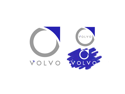
My idea was to simplify and modernise the actual logo, getting it flat but saving the symbols of the brand, the circle and the arrow. In this redesign, the arrow it’s bigger and complete the circle, with a bold and recognisable look. The logotype it’s especially made, looks modern and professional, and the detail in the V retake the arrow in the logo, as a symbol of progress and innovation, just like the automotive brand values.