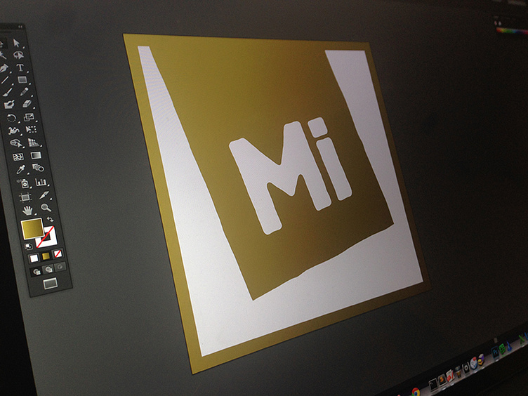
MIntigo: Identity / Logo
Mintigo is all about providing qualified leads to their clients. The motivation for this logo was two-fold... one, to play off the elements of the Mintigo algorithm for defining qualified leads (hence the Periodic feel); the second, a visual means of 'tagging' leads that were of the highest quality (lending to its skewed treatment). At the end of the day...another happy client.
More by Joshua Levy View profile
Like
