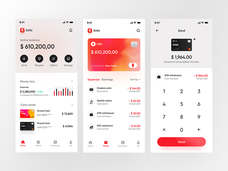
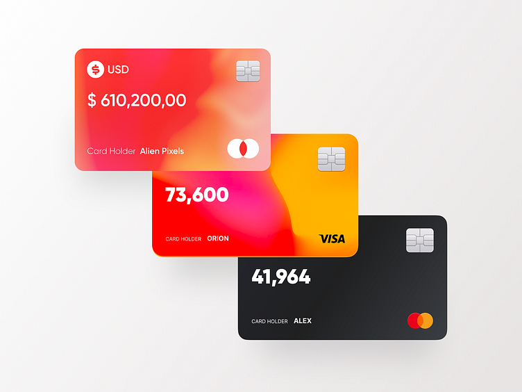
Eollo virtual bank - Tab page design
😊 Hello, a new week with Dribbbler on time.
📃 Background: One of Eollo bank’s features is to provide a bank account. We want our users to trust us more than any archaic bank. So we need to be 10 times better than them. How to be 10 times better? Every little detail counts. we had to think about how we could directly enhance user experience.
🎯 Design Goal: 1. Your user should always know why Your user should always know why he has downloaded the application. He should always know why he is using your app even before figuring out how he is going to use it. 2. Keep it simple: one screen, one action Keep it simple, focus on an action, a screen should be designed to maximise the result, one action, one screen. Do not reinvent the wheel, always remember that “less is more”. 【Button】in the screen above, we are using a big Get Started - Call To Action (CTA) button. 1. Make your CTA Button look clickable: round corner, shadow 2. Choose the proper size: a large button has high chances of being noticed and clicked 3. Apply contrasting colors 4. More imperative, fewer words 5. Smart placement can increase the chances of CTAs being noticed even more
💙 Press "L" to like and give your valuable feedback. Don't forget to Follow me. Thanks for your time and have a good day! 🔥I'm available for hire and collaboration just message me or email me for any inquiries or need some help. Don’t worry, it is secure and confidential. Looking for UX/UI Design? Learn more about my works here and contact me: Email me: 949097606@qq.com / abenzhb@gmail.com Skype me: 949097606@qq.com WeChat me: 949097606