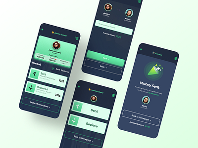
Finance App UI design
👋 Creative Brains!
Here is my new Clean & Minimal Finance App UI design. This is the Dark mode UI version of the Finance app. I will Upload the Light mode of this UI very soon.
The main focus of this finance app UI was to make it simple, straightforward — no cookie clutter. Also, I have chosen big and bold buttons for the button as the users can see the buttons from 1km far.
👊 For the colors, I have chosen dark green as the primary because green goes well with money-related app UI.
💬 Any feedback towards this Finance App UI will be highly appreciated and helpful for me.
💙 Press "L" if you like it and want to motivate this new designer 😍
More by 11hrs Creator View profile
Like
