Work on "the theme"
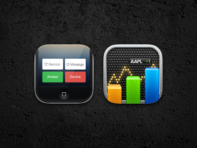
Here I have the Phone and Stocks icon of @balderoine and I's theme that we've had in the works for some time now. I whipped these up over the past few days and I've made quite a few changes since I've started, here you can see changes I made to the stocks icon over time.
Also, here are the two big stages of the phone icon, before I picked between the two.
Feedback is always welcome and greatly encouraged. Hope you like the new additions to the new theme ^-^
edit: Due to the stock icons busy-ness, I decided to break it into two pieces--the light board and the bar graph. Here you can see the updated process.
edit 2: fixed an issue with the upper right portion of stock's border
More by Morgan View profile
Like
