UN logo rebrand - proposal
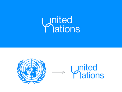
A rebrand I did for the UN logo. I noticed that their current logo isn't unique (too cliche) & has too much detail.
In my design approach, I wanted to make the logo simple and at the same time add meaning to it. Hence the overlapping of letters U & N which denotes unity, togetherness, or oneness.
More by Dickens View profile
Like
