Daily UI #053
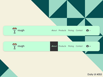
Little headline nav to take us to the weekend. Nothing too crazy, but I do really like the bar to denote a hover state. Often times I see just the text change state as opposed to its surroundings when on a hover state. This way, it's a little more obvious when you are hovering over a selection. The idea to do this for hover rather than as a breadcrumb was that more descriptive text in the body would convey the proper area in which the user is currently residing.
That's it! Like what you see? Hit the "L" and/or leave a comment! I'm always open for any feedback!
More by Charlie Beck View profile
Like
