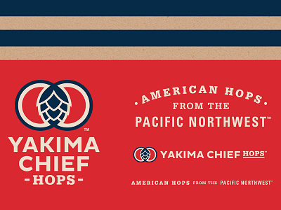
Yakima Chief Hops, Brand Identity
Thirty years of history connecting family hop farms to the world’s finest brewers, heritage was celebrated naming the company Yakima Chief Hops and developing a new identity to push the brand to become a global leader for hops. Studying the market and seeing an opportunity for differentiation, a new logo was developed celebrating the American heritage of Yakima Chief Hops and it’s relationship with the Yakama Nation. The logo represents the past, present, and future of the organization with strong American heritage aesthetics connecting you to farming and craftsmanship.
Giant warehouse murals were hand painted for weeks creating a very branded experience for drivers.
Work created while working at Retail Voodoo.
americana
beer branding
beer hops
beer label design
beverage branding
beverage packaging
branding
brewery logo
design
illustration
logo
View all tags
Posted on
Aug 6, 2021
More by ewyttdesign View profile
Like


