Daily UI #052
Make a logo, they said. Doesn't need to be crazy, just a logo.
Famous last words...
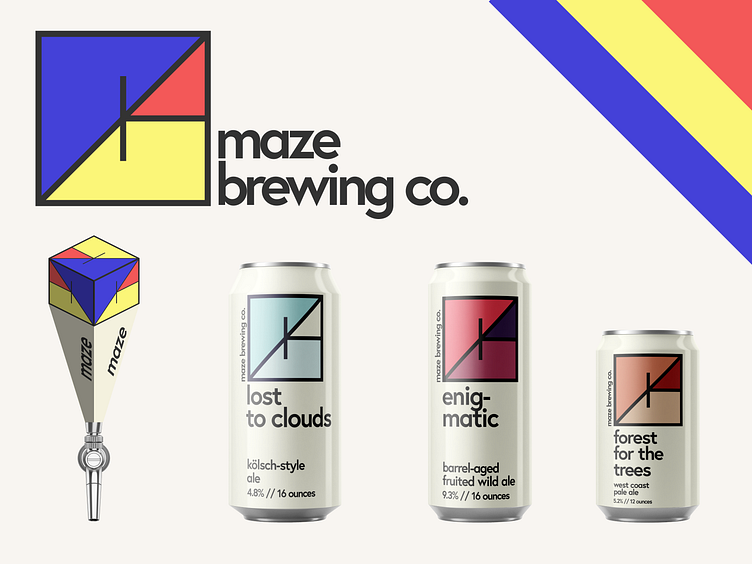
Little brand study for a theoretical brewery called Maze Brewing Company. The logo itself is a reinterpretation of the word Maze folded in on itself. The colors for the primary logo were chosen to represent a bit of an artistic take towards brewing, borrowing from the Mondrian-style color scheme. However, the primary logo colors are only used for the logo itself (whether on a sign, poster, or tap handle). For the beers themselves, they take on their own colors which represent the beer. For example, "Lost to Clouds" is a kölsch-style ale which is a crisp and bright beer. To reflect that experience, light blue colors are chosen to evoke that feeling.
I tried my hand at mocking up a tap handle, but damn is it hard. Still working on shading...
All in all, very happy with how these turned out! Like it too? Hit the "L" and/or leave a comment! I'm always open to feedback!
